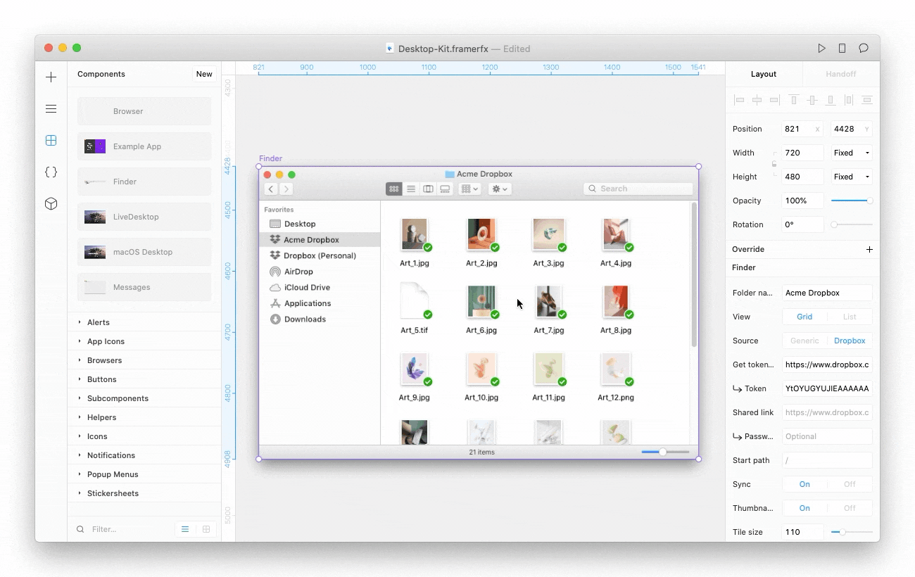
Finder
Display placeholder content or pull in live data from Dropbox when working with the Finder component. With Dropbox connected, you can navigate inside folders and even show thumbnails for image, video and PDF files.
Using placeholder content
Customize the content shown by inputting the type of content (“file” or “folder”) and name in this format: <type>: <name>
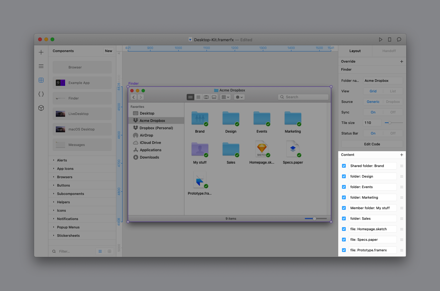
The content icons will render based on supported folder types and file extensions:
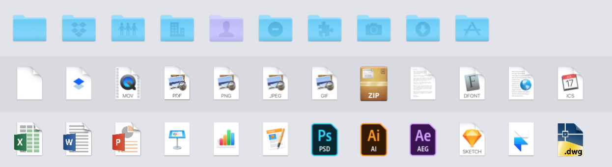
Supported folder icons
To show a folder icon, input the type of folder followed by a : (there’s a space after the semicolon) and then the name of the folder.
| 📁 Folder type | Input |
|---|---|
| Normal folder | folder: <folder name> |
| Dropbox Shared folder | Shared folder: <folder name> |
| Dropbox Member folder | Member folder: <folder name> |
| Dropbox Team folder | Team folder: <folder name> |
| Dropbox Restricted folder | Restricted folder: <folder name> |
Supported file icons
To show a file icon, enter file: (there’s a space after the semicolon) followed by the name of the file with a file extension. If there is a supported file icon for a given filetype, it will be shown.
| 📄 File type | Input |
|---|---|
| Adobe After Effects | file: <filename>.ae |
| Autocad | file: <filename>.dwg |
| Calendar | file: <filename>.icsfile: <filename>.ical |
| Dropbox Paper | file: <filename>.paper |
| Excel | file: <filename>.xls |
| Framer | file: <filename>.framerxfile: <filename>.framerfile: <filename>.framerfx |
| Generic file | file: <filename>file: <filename>.<any other extension> |
| GIF | file: <filename>.gif |
| Google Docs | file: <filename>.gdoc |
| Google Sheet | file: <filename>.gsheet |
| Google Slides | file: <filename>.gslides |
| Illustrator | file: <filename>.ai |
| JPEG | file: <filename>.jpegfile: <filename>.jpg |
| Keynote | file: <filename>.keynote |
| Links | file: <filename>.lnk |
| Movie | file: <filename>.movfile: <filename>.mp4file: <filename>.wmvfile: <filename>.flv |
| Numbers | file: <filename>.numbers |
| Page | file: <filename>.pages |
file: <filename>.pdf |
|
| Photoshop | file: <filename>.psdfile: <filename>.psb |
| PNG | file: <filename>.png |
| Powerpoint | file: <filename>.pptfile: <filename>.pptx |
| Rich Text | file: <filename>.otffile: <filename>.ttffile: <filename>.ttc |
| Sketch | file: <filename>.sketch |
| Text | file: <filename>.textfile: <filename>.txtfile: <filename>.rtf |
| Word | file: <filename>.docfile: <filename>.docx |
| Zip | file: <filename>.zipfile: <filename>.tarfile: <filename>.rar |
Sync states
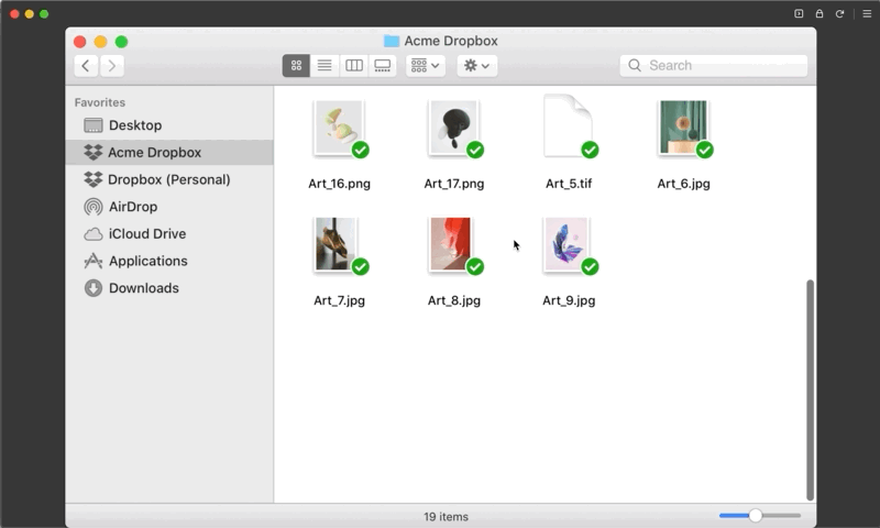
By default, all items are given the sync state of ✅, but you can simulate the other sync states for content by adding an emoji at the beginning of the line for each content item.
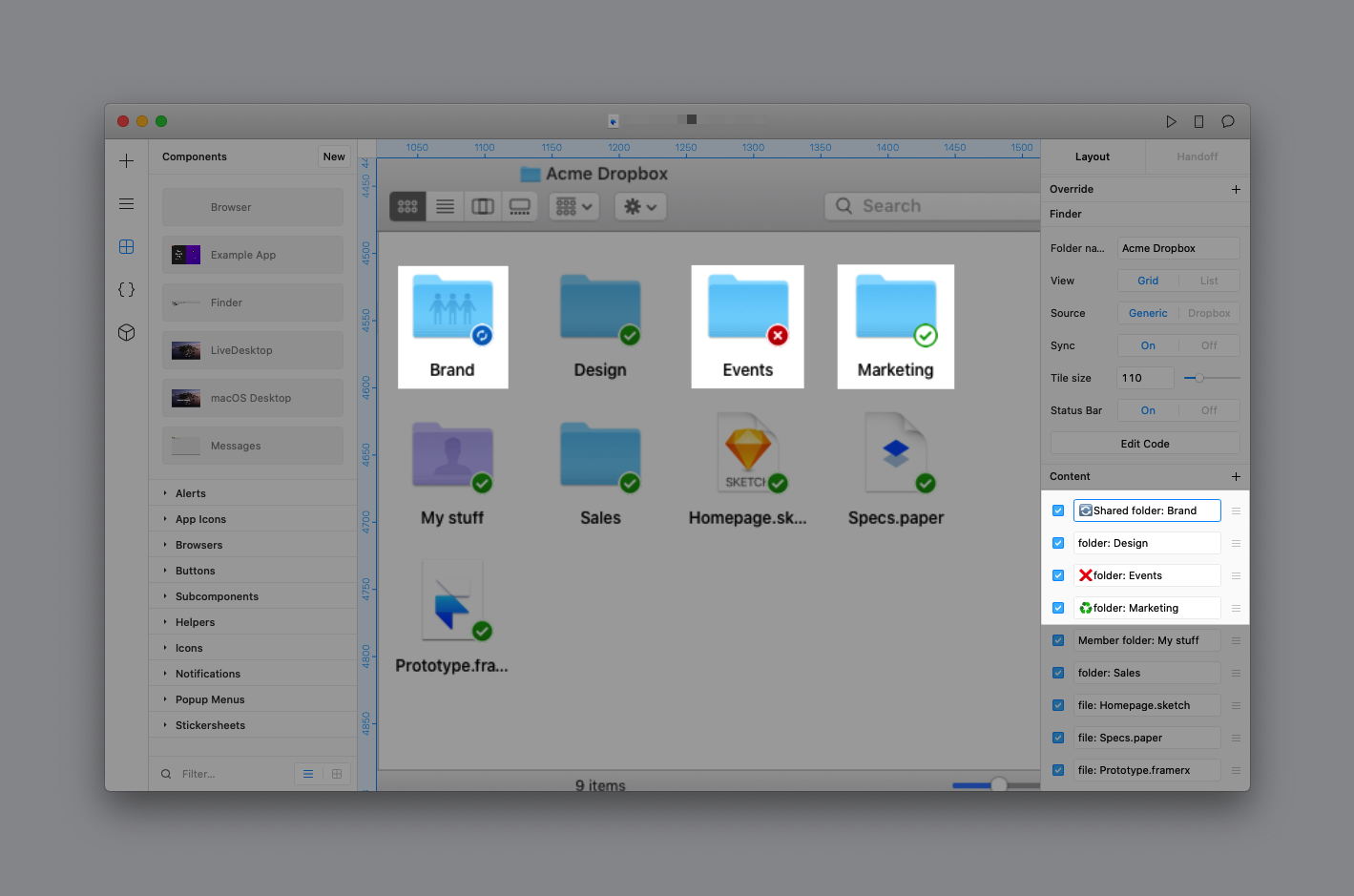
The other supported states and their emojis include:
- ♻️ Partially synced
- ☁️ Online only
- 🔄 Syncing
- ❌ Sync error
Using real Dropbox content
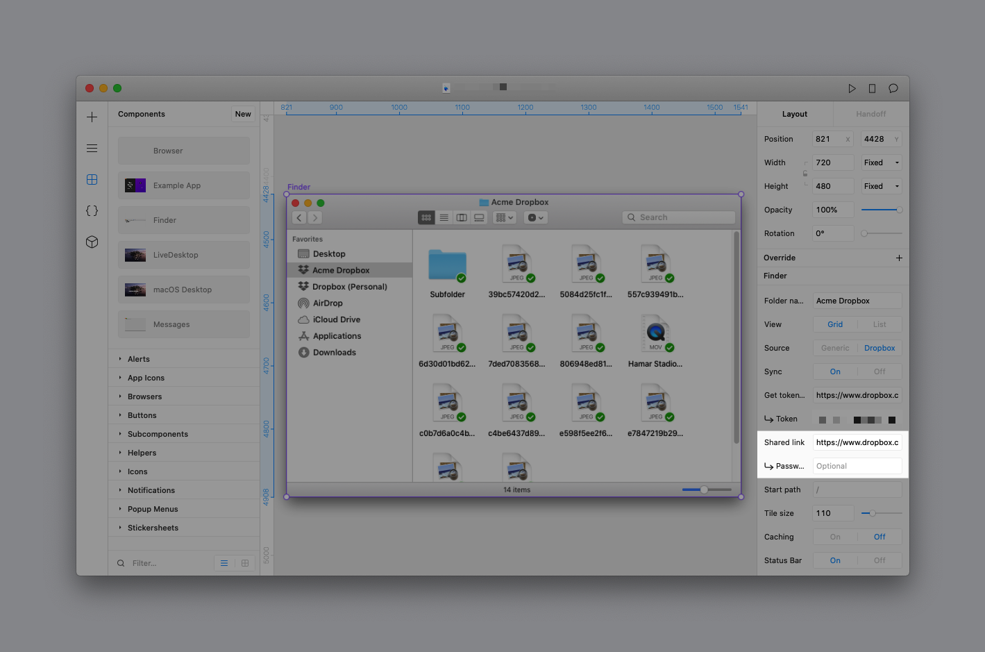
You can use real content from a Dropbox account to mimic the experience of browsing through Dropbox folders. First, change the Source in the Properties Panel to Dropbox to see the available options.
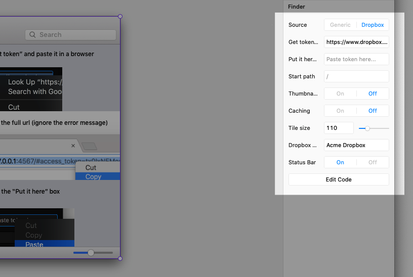
Connecting your Dropbox account
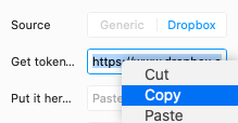
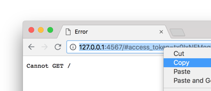
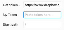
To connect to live Dropbox content, you'll need to grant Framer access to a valid Dropbox account and developer token. Once you have this set up, you'll be able to pull in live data and even thumbnails for your Dropbox files.
Here's how to get started:
Using a Dropbox link for content
While it's nice to browse your own Dropbox content, you can also view the contents of a Dropbox shared link. This is useful for user research studies that involve real content from participants. Once you've connected your Dropbox account and inputted a valid token, you can paste a link to a folder from Dropbox in the Shared link field.
Navigating folders
With a Dropbox account connected (or shared link entered), you can navigate in and out of folders while previewing your prototype.
Changing views
Toggle between Grid or List views on the Canvas or in Preview mode.
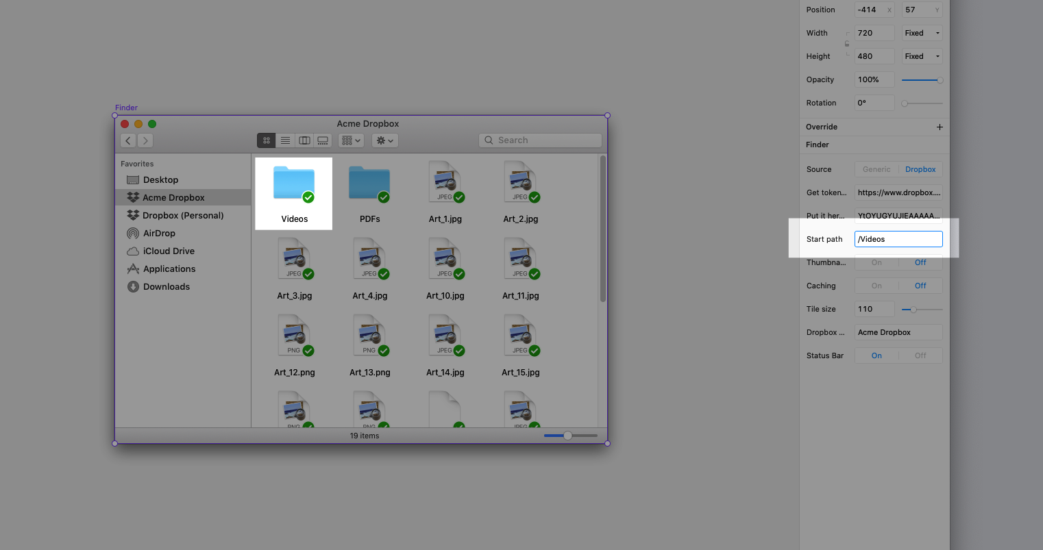
Start path
You can choose a different folder to start from within your prototype. Enter the folder path in the Properties Panel and be sure to include / in front of the folder path.
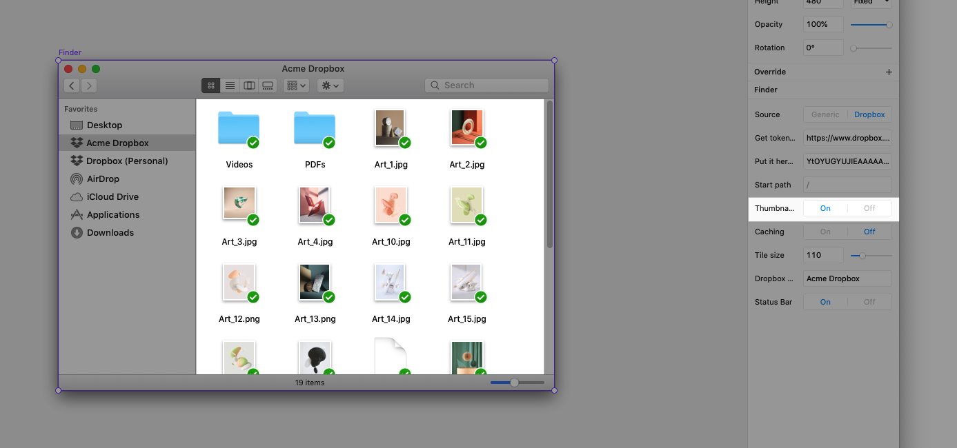
Thumbnails
Show content previews instead of file icons for images (.jpg, .png, .gif), videos (.mov, .wmv, .mp4), PDFs, Adobe, MS Office files and more.
⚠️ Displaying thumbnails is currently limited to folders with less than 25 items. It's also currently not supported for Dropbox links.
Caching
Speed up browsing within Dropbox folders, especially if the content isn't updated often.
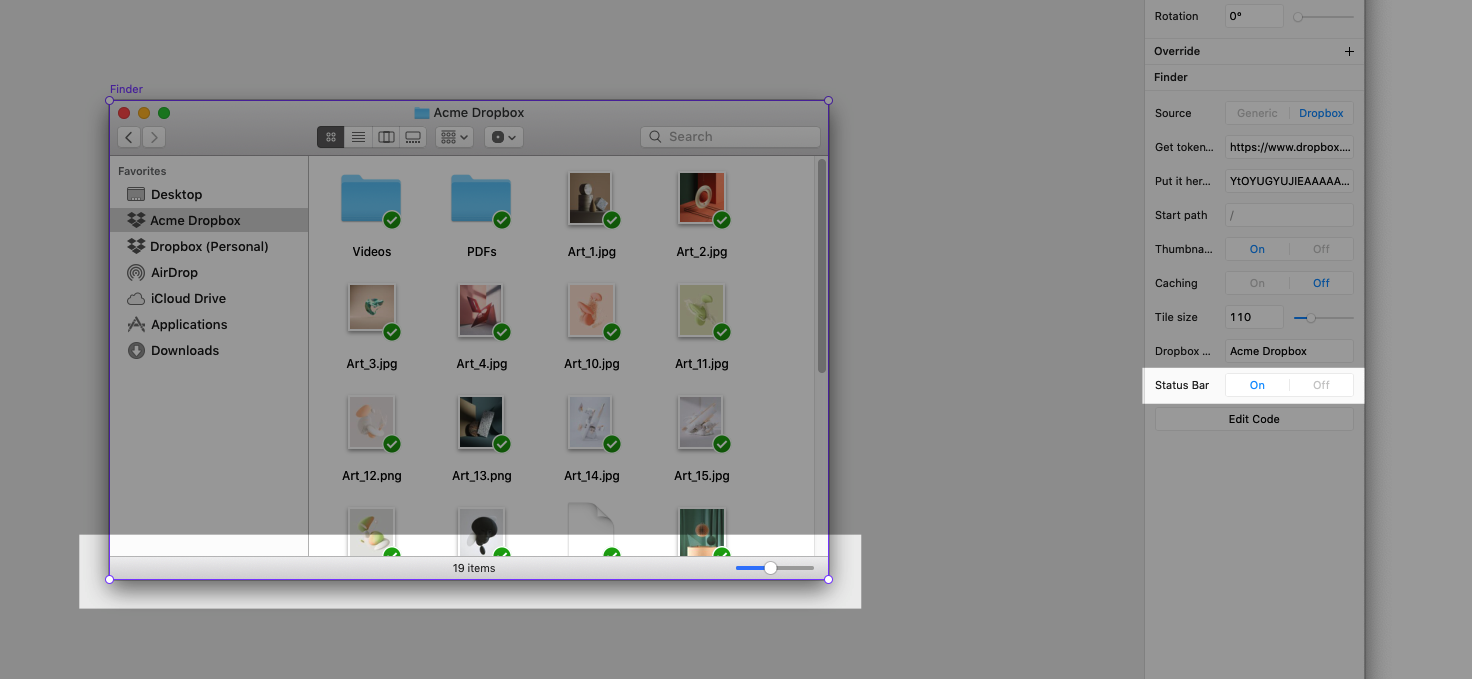
Status Bar
Show a count of items currently in view as well as a slider to change the tile size while previewing the prototype in Grid View.
Extras
Folder name
Customize the name of the selected folder shown. By default, it is set to “Acme Dropbox.”
Sync
Mimic the experience of having Dropbox offline in the Finder by turning the Sync option off. This is also a way of displaying a generic folder icon rather than a Dropbox icon in the Finder Sidebar.
Tile size
Change the default size of items in the content grid by adjusting the Tile size setting. Note that this can be adjusted in the Status Bar when in Preview mode.
FinderGrid
Use the FinderGrid subcomponent to create your own customized file-browsing experience.
| Property | Description |
|---|---|
accessToken: string |
Dropbox developer token for rendering real Dropbox content |
banding: boolean |
Display style of alternating rows |
genericJSON: string[] |
The default set of entries displayed when using Generic as source. Defaults to: ["Shared folder: Brand", "folder: Design", "folder: Events", "folder: Marketing", "Member folder: My stuff", "folder: Sales", "file: Homepage.sketch", "file: Specs.paper", "file: Prototype.framerx"] |
isCacheOn: boolean |
Cache content when using Dropbox as source |
isSynced: boolean |
Show sync status for content items |
link: string |
Dropbox shared link (token required) |
linkPassword: string |
Dropbox shared link password (shared link required) |
path: string |
Starting path of Dropbox folder when using Dropbox as source |
selectionColor: string |
Highlight color of selected item |
showThumbnails: boolean |
Show thumbnails when using Dropbox as source |
source: string |
Toggle between Generic and Dropbox as the source of content |
tileSize: number |
Size of each item when using grid view |
viewStyle: string |
Toggle between list and grid views |
| Events |
|---|
onContentLoad({contentList, pathMetaData}): void Called when content is loaded |
onItemDoubleClick({targetName, targetType, newPath}): void Called when item is double-clicked |
onItemSelect({targetName, targetType, selectedItem}): void Called when item is selected |
Content
All folder and file icons are provided as Design Components to make it easy to create your own layouts and components. However, you can also use the Content subcomponent if you need something more dynamic for creating a table/grid of content.
| Property | Description |
|---|---|
dateModified: string |
A date string written in dateString format that is shown when in list view |
dropbox: boolean |
Show Dropbox specific UI, like sync statue and permission icons |
expanded: boolean |
Toggle expanded state for folders |
fileSize: number |
A number in bytes that is converted to MBs when displayed |
fileType: string |
Type of file to show. |
folderType: string |
Type of folder to show. |
fontSize: string | number |
Font-size in list view |
isSelected: boolean |
Toggle selected state |
permission: string |
Specifies the permissions icon to be shown. Accepts "Edit", "View", or "None" |
selectionColor: string |
Highlight color of selected item |
showMetaData: boolean |
Toggle to show file metadata when using Dropbox as source |
showThumbnails: boolean |
Toggle to show thumbnails when using Dropbox as source |
sync: string |
Specifies the sync icon to be shown. Accepts "✅","♻️","☁️","🔄","❌" |
thumbnail: string |
A base64 image string that can be displayed as a thumbnail |
viewStyle: string |
Toggle between list and grid views |
name: string |
Name of the content to display |
type: string |
Toggle between file and folder |
| Events |
|---|
onClick(name,type): any Called when clicked |
onDoubleClick(name,type): any Called when double-clicked |